

If you’re building a D2C e-commerce brand, your homepage is your calling card.
Consider the fact that the homepage of your site may very well be the first impression each visitor has of your business. Whether they’re stumbling on your product as part of a web search, or have been directed to you via the recommendation of someone they know in the real world, they’re coming to your page with curiosity about what your brand has to offer.
Before they decide to make a purchase, cementing the customer/business relationship, they need to get an idea of what your brand could mean to their lives.
That means answering questions not only about what you sell and why it matters to them, but your ethos and aesthetic values as a company, and ways your product could offer them a unique and compelling benefit.
It’s clear that making your homepage the best it can be is an urgent matter—but how do the pros get it done? Here are the rules we follow at Function Growthi for making our D2C e-commerce brand homepages the best they can be.
Make navigation intuitive
Easily navigating an e-commerce site is one of the most basic aspects of consumer experience—so if you fail to establish an easy, intuitive flow of information your brand will suffer.
Consumers visiting a web page for the first time are entering into an unfamiliar space—and if there’s anything we know about human psychology, it’s that unfamiliarity breeds discomfort. It’s up to you to establish a web page that feels easy and intuitive, effectively welcoming them in and reducing the mental barriers to engaging with an unfamiliar brand and digital space.
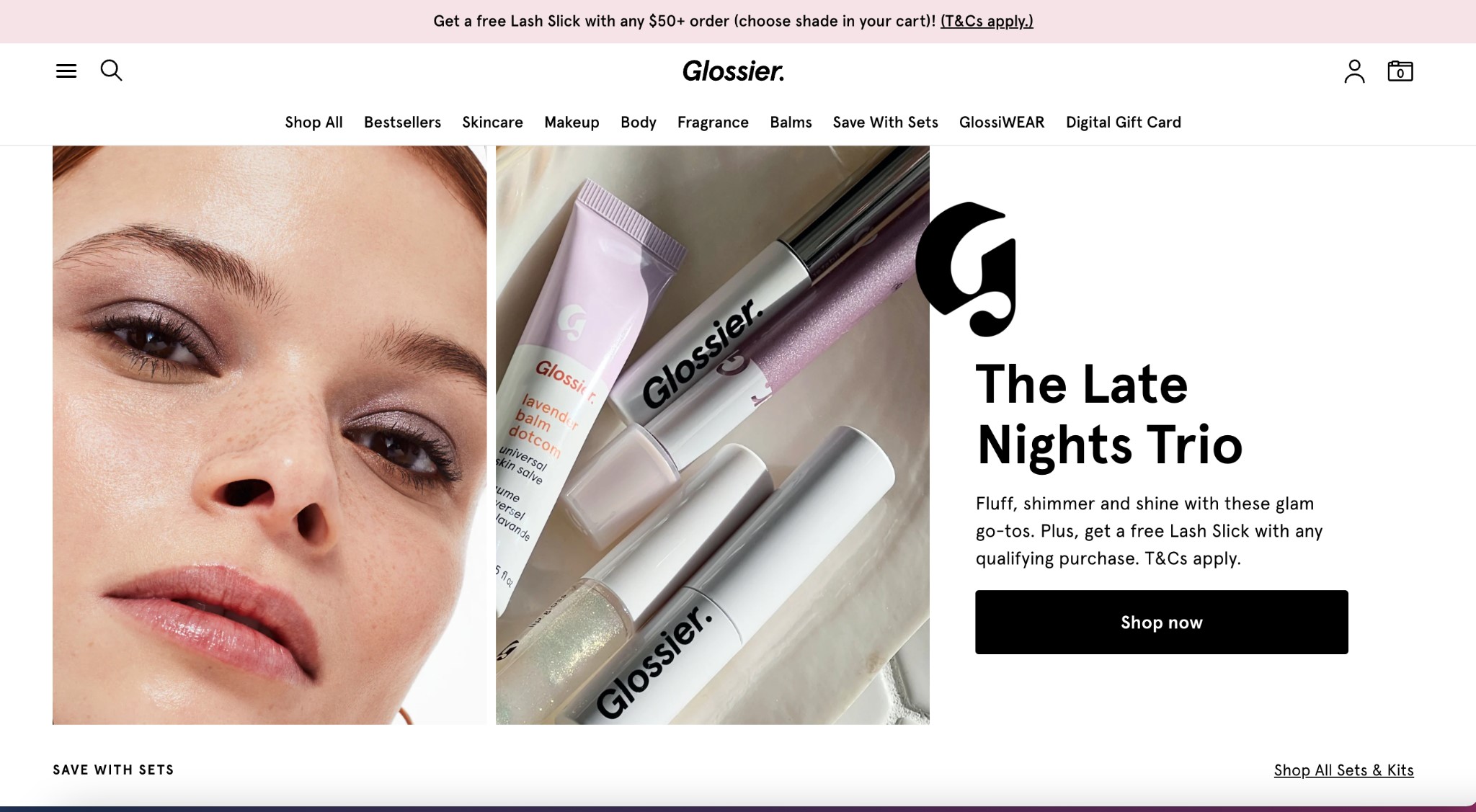
Above all, your homepage’s navigation must be well-organized with clear product categorization. First time visitors should never struggle to find the product they're looking for. If they do, you risk them losing focus, clicking away, and even turning to a competitor whose website offers a less cluttered experience.
In the screenshot above, we see how eternally popular e-commerce makeup brand Glossier solves the navigation problem with clear, clickable categories presented front and center. A first time visitor is able to navigate to their product category of choice with ease, not even needing to scroll down the page.
Create a visually engaging hero
Human beings are visually driven creatures—-especially when it comes to shopping. A brand’s aesthetic communicates a tremendous amount of critical information in the minutes, or even seconds, after a shopper first clicks over to your homepage, so it’s important to get your visual rhetoric on point.
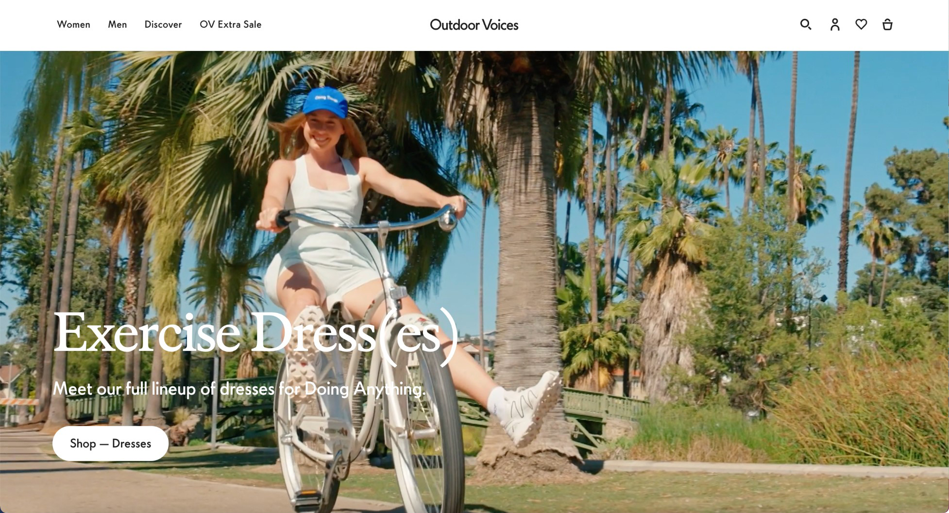
The hero image of your web page serves a critical function in this respect. When we engage with a new brand, we need to be immediately taken by their visual presence, as well as the information that visual offers.
Is this brand “for” us? Does it align with our aesthetics, goals, and values Does it present a vision that resonates with our own self image, or the image of the person we want to become though engaging with this product?
A good hero image should not only be visually engaging to grab attention, it needs to showcase product in a way that feels dynamic and compelling.
In the above example, exercise brand Outdoor Voices uses a hero video, rather than a photograph, with constantly changing images to grab the visitor’s attention. A model rides her bike with legs flying in the air, wearing one of the brand’s signature exercise dresses and a cap emblazoned with the brand’s logo. The image showcases the brand’s ethos of fun loving, aesthetically appealing recreation, inviting visitors to engage with their world.
Establish your RTBs
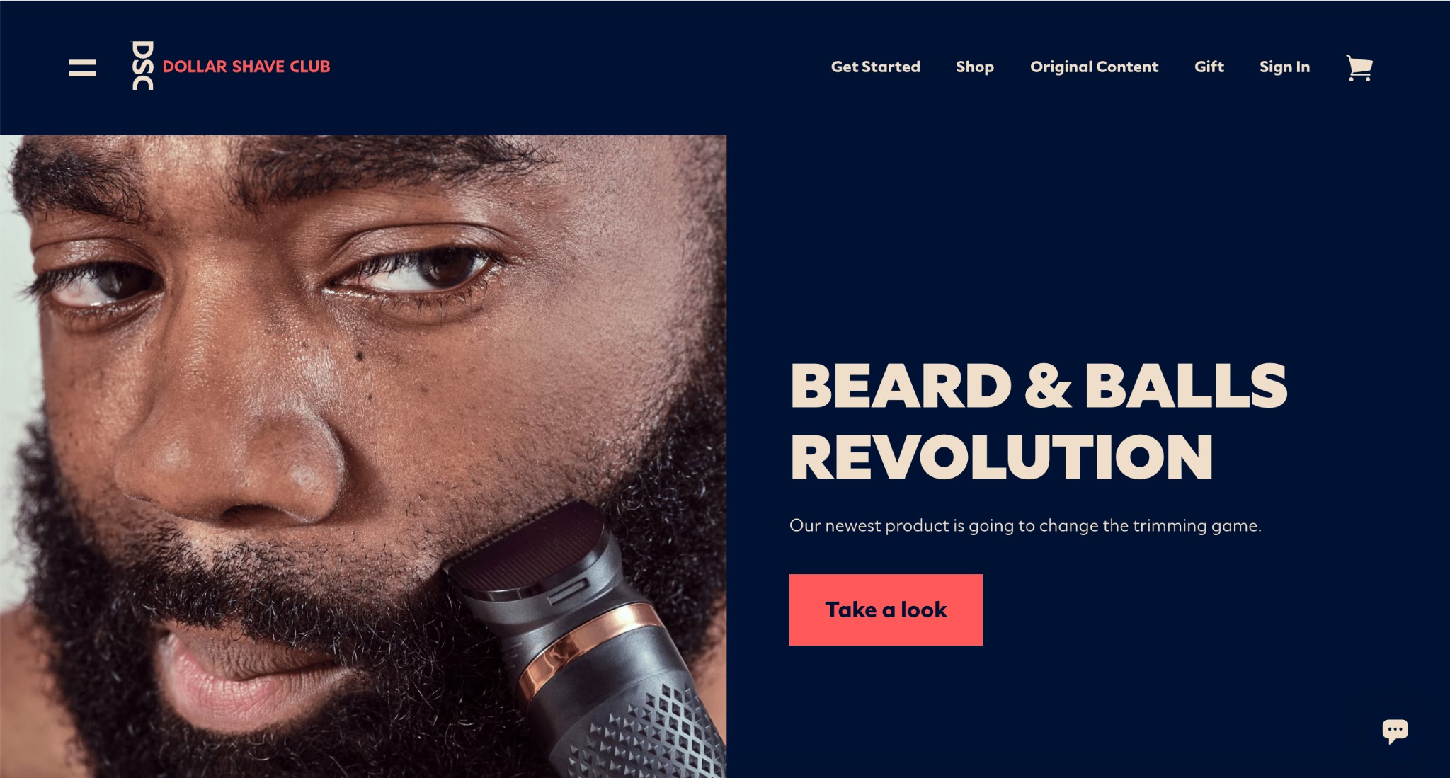
E-commerce trailblazer Dollar Shave Club was one of the first brands to effectively harness the power of direct to consumer marketing via podcast ads, a subscription model, and a friendly, easy to engage with website. In the above screenshots, we can see how they effectively master the art of the RTB—or reasons to believe.
Put simply, the RTB answers the questions that will be top of mind for any consumer visiting your website for the first time. They’re wondering why they need your product at all. What makes you stand out from your competitors in the marketplace?
Placing the answer to these questions up front and center on your homepage ensures that curious consumers are given critical information as quickly and effortlessly as possible. You’re able to pitch them on the value you offer as soon as they enter your digital space.
Dollar Shave Club achieves this goal by using a cheeky headline that catches visitor attention immediately, with a subheadline explaining that their “newest product is going to change the grooming game.” It showcases utility and points out difference, all within a few lines of effective copy.
Share social proof
Community support is one of the most critical aspects of whether or not someone makes a purchase decision.
You’ve experienced this effect first hand if you’ve ever gone shopping with a friend and ended up walking away with an outfit that you weren’t sure about, but your friend insisted looked great on you. When people we like and trust encourage us to make purchase decisions, it’s all the easier to go for it.
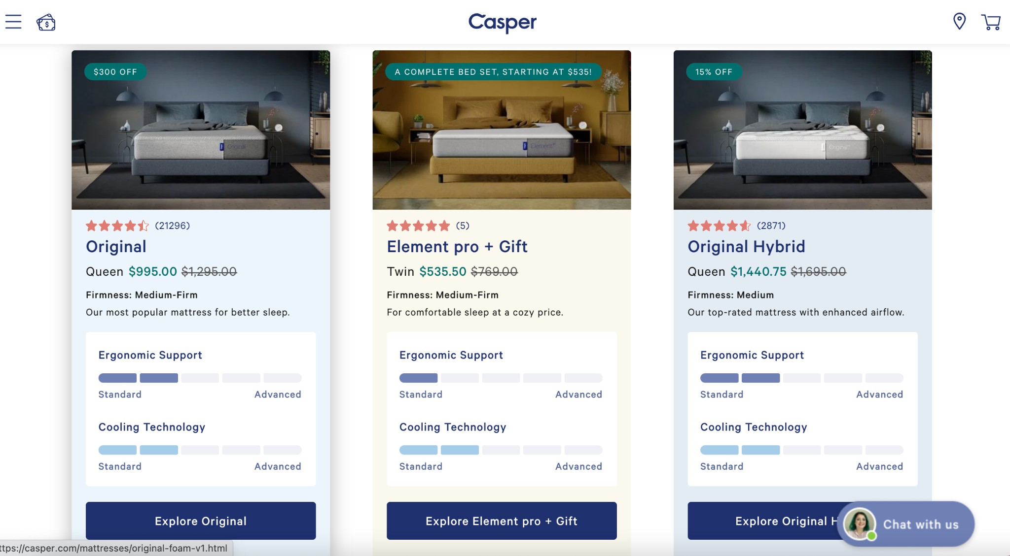
This effect is equally true when we rely on the social proof provided by strangers in the form of testimonials or online reviews, as evidenced by the homepage of groundbreaking D2C mattress brand Casper.
When you visit the Casper website, social proof is front and center. In fact, it’s the first thing you see. Images of some of the mattresses on offer are paired with star ratings, and an indication of how many times each mattress has been reviewed.
Seeing that thousands of other shoppers have bought and enjoyed each mattress compels the visitor to click through and find out more, perhaps even reading additional reviews before completing a purchase of their own.
Don’t be afraid to educate
Our impulse in building a homepage is to keep things as simple and stress free as possible. Generally this is a good instinct—but there are times when simplicity goes too far.
Some products need a certain level of education in order for consumers to appreciate the differences in what they have to offer, both in terms of how they stand out in the marketplace, and the unique experiential value consumers can expect from their purchase.
In these cases, don’t be afraid to educate—and don’t be afraid to do it right up front. You might think that product features are better off buried deep in the descriptions of individual products or categories, but when you keep the unique features of your brand hidden you risk consumers not getting that far.
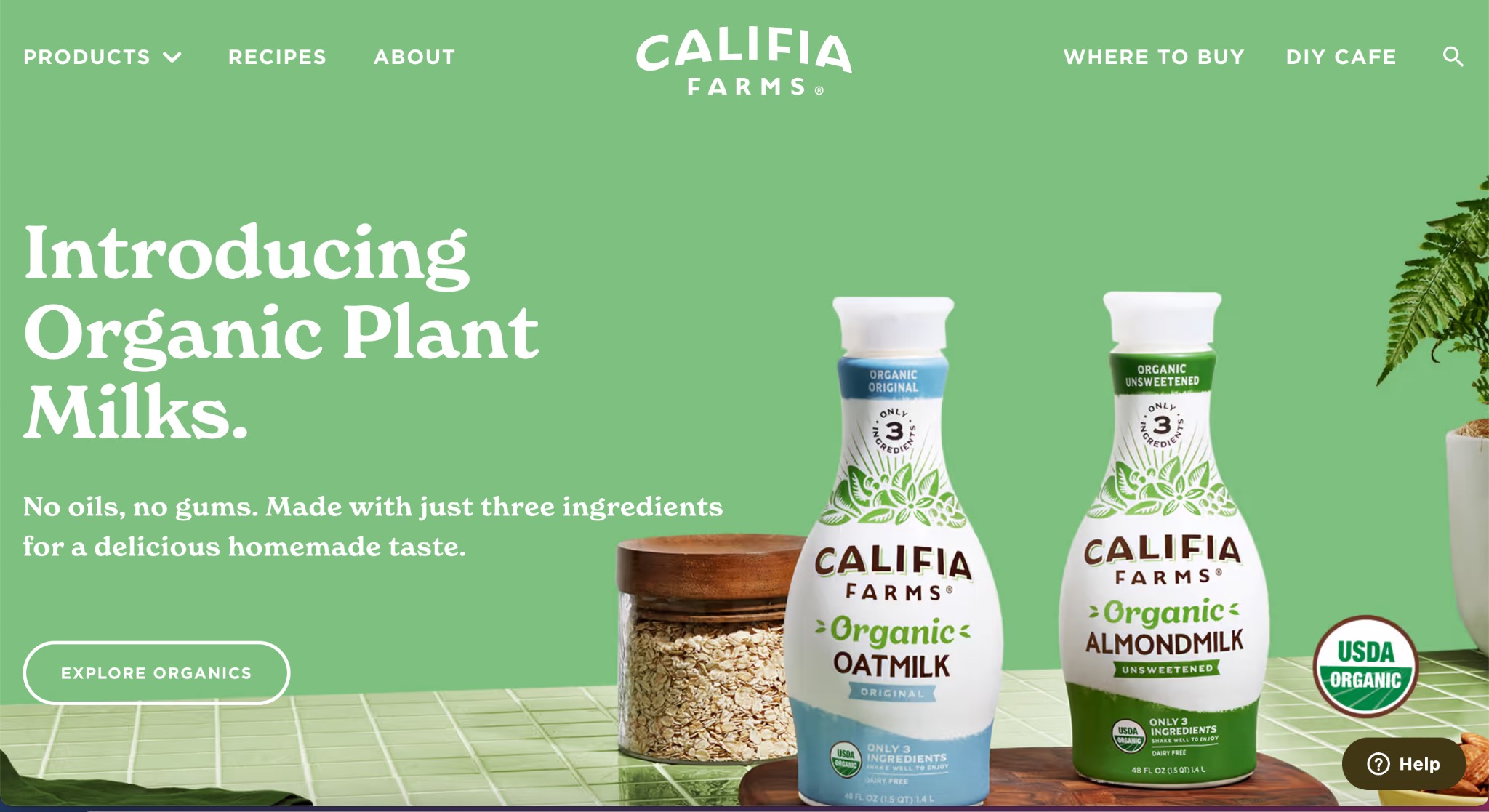
The example of Califa farms’ homepage is a great synthesis of education and simplicity. The page is visually striking, with easy to find categories and simple text that highlights the difference their brand offers, and the way it stands out from the competition. Short, sweet, and to the point, this homepage inspires shoppers to dig deeper into the Califa brand.
Don’t be shop button shy
Last but not least, a good e-commerce homepage needs to make it easy to shop! That means that consumers should be greeted early and often with compelling, clickable shop buttons that will take them from the homepage into product categories and individual product pages.
You need to make the process of moving from brand discovery to shopping as simple as you can, ensuring that a retail decision is one easy click away.
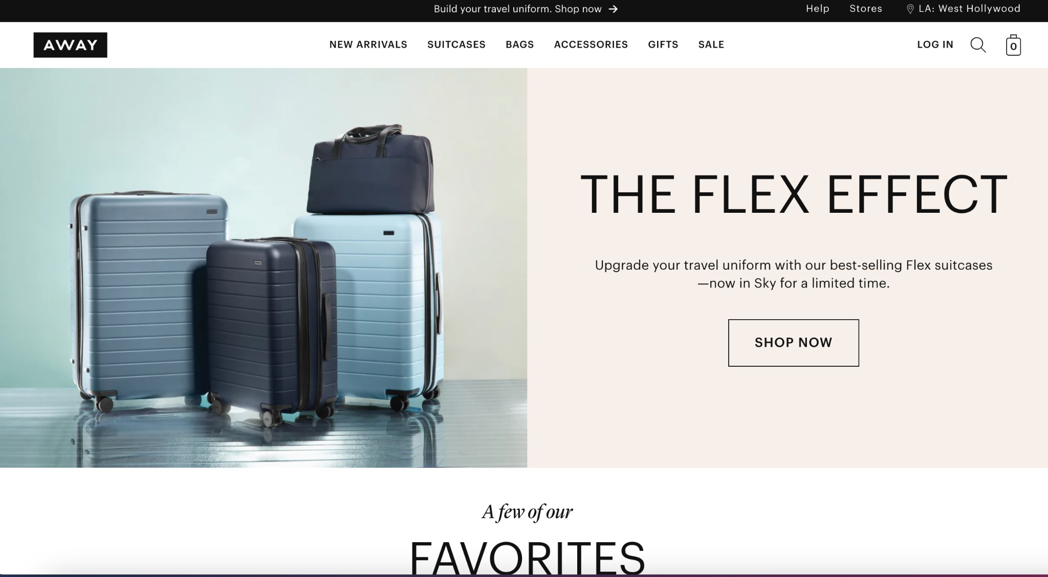
In the above example, we see how cult favorite luggage company Away offers multiple compelling opportunities for shoppers to click through. A large Shop Now button at the center of the screen anchors the page, but they don’t stop there. At the very top of the page are two opportunities to shop—a text bar inviting visitors to “build your travel uniform” and product categories linking to shoppable pages. Scroll down and you’ll be met with clickable images of their collection favorites, with shop buttons associated with every product listed on the page.
Comprehensive but not overwhelming, it offers visitors the repeated opportunity to make their first purchase, following the pathway that feels most intuitive to them.
The takeaway
Building an effective B2C e-commerce brand is never easy, but when you take the time to create an effective, shoppable, and visually compelling homepage, you’re setting yourself up for success. These brands offer the perfect model of how to make a homepage that works.
There’s no one right way to make a homepage functional, so ultimately the specific path you take will be determined by the nature, values, and aesthetics of your brand. Still, making sure that your site is addressing all these concerns will help you avoid the major pitfalls that cause consumers to lose interest and navigate away from your page.
Following these tips will allow you to easily build a homepage that feels like, well, home, encouraging consumers to stick around, dig deep, and build and authentic and compelling sense of brand loyalty that will guide them through their first purchase and beyond.
-
Make navigation intuitive
A messy website creates a stressful, visually confusing experience that makes it more likely that consumers will click away. The more intuitive your navigation is, the more likely it is they’ll stick around.
-
Create a visually engaging hero
Your brand’s aesthetic presence is the key to its appeal. Establish your ethos up front with the effective visual rhetoric of a good hero image that creates an appealing energy and sets the tone.
-
Establish your RTBs
Why should consumers bother with your site at all? The answers lie in your Reasons to Believe. Your homepage should showcase those RTBs upfront, so consumers understand the value your brand presents.
-
Share social proof
Humans are social creatures, so the more your brand can do to help shoppers feel connected to one another the better. Having reviews and testimonials up front and center creates social proof to encourage shopping.
-
Don’t be afraid to educate
Your brand is better than the rest, but consumers need to know why. Educating them about the value add you present up front creates buy-in, helping show them why you’re worth adding to their lives.
-
Don’t be shop button shy
Afraid of being pushy with too many shop buttons? Don’t be—customers like multiple options to guide their shopping journey.
In our latest blog, we break down the hows and whys of all these critical principals of homepage building, sharing examples of how the most successful D2C e-commerce brands have harnessed them to create compelling homepages that encourage consumers to stick around, and keep coming back for more.